


(Untitled)
My zine is in the traditional zine format of loosely bound pages. I apologize for the scanning, some images are crooked. Also, the transparent layers are basically invisible. Several members of the class have seen them so they do exist!

Concept:
memories are selective and the color of those selections becomes achromatic over time. memories from a past, maybe mine, maybe someone else's...It's a personal yet impersonal selection.
Why?:
2 years ago a large box containing all my saved mementos, photographs prior to digital, letters, collections, etc. was stolen out of a locked car while my bf was moving. I'm now obsessed with retaining memories of my past. The artifacts of my life were gone in an instant and the memories of those moments are fading with time. Luckily some photos I had scanned.
Materials:
scanned film and digital photographs
transparencies
inkjet printer
Process
I assembled photos into a little booklet. Over most pages I selected parts of the memory that were remembered and added color to them. This I printed onto transparent layers.
When you page through the zine, a different memory's achromatic color can be viewed on the adjacent page creating a subtle change in composition. I though this was interesting.
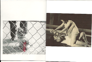
For instance page 1 has a little dog behind a fence with a red cast that is initially viewed as a red object over two women struggling.
I think these new compositions and elements are interesting to discover, they help you remember the moment, and I chose them as selections of that memory that were remembered.
With the dog example, I never remembered the actual type of dog or that it was even behind a fence when I took the photo years ago. I only remembered that it had a red cast. The two women struggling is timeless yet it's faded color places it in the past. (from a movie poster my aunt was in in the 60s Philippines).
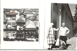
On page 10 is a family moment. It feels both happy and melancholoy. Its adjacent transparency has an achromatizing color bridge of pink. To let your eyes settle is to notice the towers behind the thick fog. Was it a happy day? was it melancholy? I don't remember but I've always remembered the thick smog that came out greys and pinks from the disposable camera that I finally developed 7 years since the photo was taken.
Next prototypes...I'd like to add more elements to the transparencies between spreads that are more hints of color.
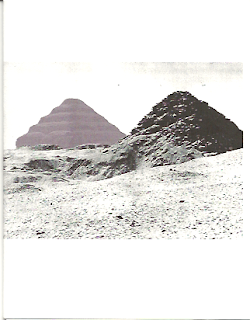
I also am interested in adding dimension to the zine by printing the zine onto all transparencies and binding it in such a way that i can fan it 360 degrees out as in this image below. I'd like to evenly space each transparent page so that the are a even distance from each other. This would be held up by string as it spins around and colors blend furthur blurring and abstracting these memories.

Do you have any suggestions for me? Feel free below....


i love the binding idea of having it as a 360 layout. it reminds of of "the carousel" from mad men. the main character sells the slide projector and describes lots of emotions going up and down and around. I could already envision the emotions that you could portray with just color on a black and white photo. (http://www.youtube.com/watch?v=suRDUFpsHus) maybe it actually spins and then when you see all the colors spinning it depicts another sense of emotion or memory that is controlled by the reader? ... because the color aspect seems to be in context of you and your memories. so how can this be something that someone else can feel the same/or maybe not the same and understand/or try and want to understand how you felt at the time.
ReplyDeleteCheck out Coptic binding methods.It seems to be the best solution for the circular shape you want your book to take.....(http://www.google.com/images?q=coptic+binding&oe=utf-8&rls=org.mozilla:en-US:official&client=firefox-a&um=1&ie=UTF-8&source=univ&sa=X&ei=MIeLTfWEMpOltwe48sjgDQ&ved=0CEsQsAQ&biw=1436&bih=696)
ReplyDeleteLove the idea so far, can't wait to see the zine live!
ReplyDeleteIn thinking about your comment about "more hints of color" I thought:
1. Maybe light reflects from something to create color ON the zine- this object could be a Modile made of colored filters that hangs in the window. Cheezy? But fun! They evoke "old" or nostalgia.
2. Thread could be used to show up occassionally- imagine the paper is like a Pillow case and the thread is INSIDE, so that it "sews" through the the image when needed. Loose bits could be hanging out. OR the binding could be sewn and the thread could be different colors that bind the pages? Thread has a craft connotation, but that also evokes HISTORY!
3. The color of the paper, could be really quiet, or the black/white ink situation could be "toned", so that we don't even see it, but we FEEL it!
Hope it helps, sorry I missed it in class- my apoliges!
Be well Tom
I love how delicate the photos are, they are really beautiful images. The range of value within the greyscale is very nice, especially in the photos with the couple and the houses. I also like how the content of the photos aren't all playful memories, "like my 7th grade album with me and my besties!", they are very real and relatable. I also think it is very interesting because of the assigning of colors. When I think of this memory, I think of this color. The concept is awesome. Also, that you actually created a traditional zine, very cool.
ReplyDeleteI like your idea a lot suz. Have you thought about the relationship between the images on either side of the page? It's about memory, but do we remember the good or the bad? The dog image next to the women struggling really paints a dynamic story. I like how the imagery feels timeless too :)
ReplyDeleteThis comment has been removed by the author.
ReplyDeleteI love your photos and they seems to have many stories behind them. I wonder if you ever want to write some short text about your "memory" next to those photos, or do you think the color part should be enough?
ReplyDeleteI like the photos you chose which are powerful to show your intention for you zine and if you are going to bind them as a 360 layout, then I imagine the time order of you photos. It could have no start point but I guess viewers can find the flow of the time of you photos.
ReplyDeleteEveryone (including me) seems to love the photos you have used, you really have succeded in getting across this idea of memories and how vague memories can be. Sometimes when I look back and remember things it is never like a clear image so maybe you can play with that more, maybe its just me but when I remember things the older the memory is its no longer one clear image
ReplyDeletealso love the photos, and agree that maybe some type of text somewhere could be nice to illuminate what you remember or what you were feeling when taking the picture? even just cryptic words/short phrases?
ReplyDeleteSuzanne, just looking at the pictures alone got me thinking of so many different narratives. Each picture and the way it has been presented was very memory like. I almost want to go in and grab it. After reading your description it just got better. Words add a lot to your zine I think, it makes it more personal but as you said it can be impersonal too. Anyone will be able to relate to the idea, most of us latch on to memories and don't want to let go. Has such a nostalgic beauty to it!
ReplyDelete