Thursday, March 31, 2011
Finished "Zinee"
So as you all know i was planning on doing a vid sooooo here's the "finished" product (it's on my tumblr)
Tuesday, March 29, 2011


Alexa-First version of zine

The Expanded Woman Zine
This is my first comp of my sine. I discovered that I need to use thicker paper for the first portion of the sine to make it easier to turn the pages. I like the tunnel effect but it needs more imagery. I also needed to come up with a better solution for the cover of the book.
Weekly Pic

I love how the sky goes from greyish-purple then a little yellow blends in, then it becomes red-violet, to a real pink. The clouds are a blackish-purple. (Its so hard to describe colors!)
-sky in LA


This picture consists mostly of shades of green, blue, grey, and brown.
- Road in Northern California


The light hits the house in different ways causing there to be many different shades of orange although the paint is the same color.

Monday, March 28, 2011
My Storytelling Zine


weekly photo by Sena

Sunday, March 27, 2011

Saturday, March 26, 2011
Shaun - Homework - Week08 - Zine


Inspired by the eastern view on “white,” my zine uses the haiku of the famous Japanese poet Kobayashi Isaa and the photos I took to represent my idea of “white.” Born in 1763, Kobayashi is regarded as one of the four haiku masters in Japan. His haiku are often about everyday life. I use the most basic need for human—food (rice and noodle) and the basic eastern tableware (cup, bowl, chopsticks, & spoon) as the theme. By combing the images and the selected haiku, I tell the story of “white.” The title of this zine is called “A Cup of White Tea” because Kobayashi’s name Issa means “a cup of tea.” “White” represents empty and void, but that doesn’t mean lifeless. It means full of energy and imagination. An empty bowl is full of life because it could be filled with anything. The possibility of “white” is endless.
P.S: It is hard to tell in the photos, but the background colors of the haiku parts are in different "white" and the English translation of the haiku are also in different "grey."
Shaun - Weekly Photo 09

Moon in Daylight
Yu-Hsiang "Shaun" Chung, 6pm, March 17, 2011.
Woodside, Queens, New York
Shaun - Weekly Photo 07

The Biggest Moon
Yu-Hsiang "Shaun" Chung, 11pm, March 19, 2011.
Woodside, Queens, New York
Holi The Hindu Festival of Colors


Holi celebrates the passing of winter and the coming of spring with exuberant bursts of color. Across India, color explodes from every direction as dye or as powder, coating people, buildings, any and all surfaces.

The Big Picture
Friday, March 25, 2011

Weekly Pic

A street in San Francisco's Sunset District, near the ocean. This picture makes it seem like the neighborhood's name is appropriate but usually the Sunset District is so foggy and grey that you can barely see 10ft in front of you. That is why I really like this picture. I think sunsets are beautiful but this one was so striking because the color of the sky is so unusual for that area. That is what made it stand out to me and made the orange and yellow of the sky seem exaggerated.
Thursday, March 24, 2011
Help w/ Cover

Hey all,
I could use some ideas on what to do for my cover.
-Do I need a title? Should I reveal with no words what the zine is about?
And just any ideas of ways to show what my zine is about.
Thanks!
zine update
Flip a coin, Duality.

This is a scanimation ready image. Scanimation is made possible with two parts. One image, the static image, looks like the dog above. It is actually 3 images superimosed on top of each other. A key to this is having a fixed point that is the same for each. The second part is a dynamic screen of black stripes. When the stripes are pulled over the static image, it appears as if the dog is running :) I'd like to do something similar with the screens of my zine, but with people and emotions. I'd like to use extreme facial closeups. With each new pull of the screen a different person, a different face, a different mood. ( Or maybe a differnt part of the face is revealed through pulling back the layers? thoughts? ) Since there are two sides of the zine, I'm still thinking about the content of each, are they analagous? are they inverses? is it the same person? I'm thinking deeper than happy or sad... Here are some facial inspirations from boston's big picture blog.


Below is how I would transform the texture and lines of the face into a graphic format and then I would segment it up and animate.

I'm interested in this idea of getting people to interact, to see one another. Pay attention to those around you.
I appreciate any feedback ;p
HELP!!!
Ok so I just sent this to Thomas and Julia, if anyone has any feedback let me know!!!
Ok so I've been making a million of those word collages. I made a short stop motion of the collages forming and coming together, but it's only alright. And i was thinking that I could fill the background with solid colors like those that move through the text, but I would need to make a stop motion of about 200 slides and making one for 40 took me about an hour and a half :/ But the thing about this all is that I'm not too sure if the word collage thing is really that powerful. I mean the beginning part will be INTENSE, especially with the paint on my face and the colors flashing (don't thin I will include sound it will be "trippy" but that is not really my aesthetic).
What i want from the word collages is to take words from their connotations and literally redefine them as images. There's a poet, Leslie Scalapino, who speaks of seeing a No Drama when she was little. She didn't understand the words, but she gained an almost fluent understanding of the drama because of the motions and emotions of the actor's words. I want to replicate this with image. I want to deconstruct "Negro," "White," "Purple" and show how insufficient these words are in describing identity of anything from a person to a vase.
The collages that I made are supposed to display motion, but for some reason (I haven't been able to project them yet, I'm, using a studio with my friend tomorrow) I don't think that they are powerful images. I want to make a transition from painting my face black and white (like in the first part with the flashing colors) to literally projecting the words onto my face to projecting patterns onto my face. I want the collages (patterns) to really shake the audience. Should I make the colors "vibrate"? Change the colors to what I know would vibrate? Would that display my idea in a more impactful way?
You said to cross limits and make people offended and I just don't feel like I'm there yet (although black and white face should get me relatively close to this). What do you think?!
Nick
INSPIRATION!

Here are a few images from the class work and galleries in Chelsea right now (a virtual view of NYC art scene- as you all are so busy!- But the show at Yvon Lambert is great if you can go!)

Your work!
All,
I was just looking over your work with another brain and they were so excited about the images of the zines, but they wanted to know more about your INTENTIONS!
It made me think. If you FLESH OUT your intentions. Ask yourselves, "Why do I want people to have this experience? What do I want them to Learn/Think/Fantasize about? And how can I get them to do that even more!
I had a prof. in college who said, "Do you care what people think?" I said, "Not really" and she replied, "Well, your work has some heavy fascist undertones." And I balked! "WHAT?" She explained and I realized that my work was not connected to the history of what I intended, but more to the aesthetic of the propaganda around Fascism!
SO, I researched images of what I wanted to say- VISUALLY! What images existed in history that had my message....sort of a family history of MY MESSAGE! Then I plugged in those elements and VOILA! The message read more clearly, while still being me.
SO,
1. In WORDS: Clarify what you want to say/do and get it REALLY SPECIFIC! Expand it, Play with it, then PICK IT APART until it says EXACTLY what you want in WORDS. (10 minutes sitting with a grumpy friend will help with this! As they tend to speak their mind.)
2. Considering the WORD you came up with: Look for images that create that thought or mood in you.
3. Compare your project to those images, what could you ADD to yours or how could you ADJUST yours to reflect the CLARIFIED INTENTION you now have?
I think these projects are really powerful and full of your SOULS- so I am excited to see them perfected!
Be well have a great weekend!
Tom


Wednesday, March 23, 2011

Suzanne's Zine Prototype
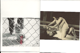


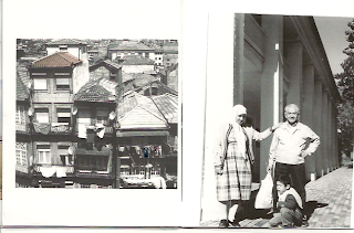

(Untitled)
My zine is in the traditional zine format of loosely bound pages. I apologize for the scanning, some images are crooked. Also, the transparent layers are basically invisible. Several members of the class have seen them so they do exist!

Concept:
memories are selective and the color of those selections becomes achromatic over time. memories from a past, maybe mine, maybe someone else's...It's a personal yet impersonal selection.
Why?:
2 years ago a large box containing all my saved mementos, photographs prior to digital, letters, collections, etc. was stolen out of a locked car while my bf was moving. I'm now obsessed with retaining memories of my past. The artifacts of my life were gone in an instant and the memories of those moments are fading with time. Luckily some photos I had scanned.
Materials:
scanned film and digital photographs
transparencies
inkjet printer
Process
I assembled photos into a little booklet. Over most pages I selected parts of the memory that were remembered and added color to them. This I printed onto transparent layers.
When you page through the zine, a different memory's achromatic color can be viewed on the adjacent page creating a subtle change in composition. I though this was interesting.
For instance page 1 has a little dog behind a fence with a red cast that is initially viewed as a red object over two women struggling.
I think these new compositions and elements are interesting to discover, they help you remember the moment, and I chose them as selections of that memory that were remembered.
With the dog example, I never remembered the actual type of dog or that it was even behind a fence when I took the photo years ago. I only remembered that it had a red cast. The two women struggling is timeless yet it's faded color places it in the past. (from a movie poster my aunt was in in the 60s Philippines).
On page 10 is a family moment. It feels both happy and melancholoy. Its adjacent transparency has an achromatizing color bridge of pink. To let your eyes settle is to notice the towers behind the thick fog. Was it a happy day? was it melancholy? I don't remember but I've always remembered the thick smog that came out greys and pinks from the disposable camera that I finally developed 7 years since the photo was taken.
Next prototypes...I'd like to add more elements to the transparencies between spreads that are more hints of color.
I also am interested in adding dimension to the zine by printing the zine onto all transparencies and binding it in such a way that i can fan it 360 degrees out as in this image below. I'd like to evenly space each transparent page so that the are a even distance from each other. This would be held up by string as it spins around and colors blend furthur blurring and abstracting these memories.

Do you have any suggestions for me? Feel free below....
Zine - ART & CRAFT STORE IN THE CITY
Paper Presentation is a arts and craft store (23 W 18th Street . 212-463-7035) that has everything from stickers, a huge paper selection, stamps for people doing patterns and all sorts of other little things. They are kind of pricey but its a huge store. You can probably find anything and everything here.
Tuesday, March 22, 2011


Worksheet
Worksheet March 22, 2011
Where do you see color communicating in your world. Now look at controversial or political social problems and how your awareness of color can change or improve those situations.
Look Back: How does color communicate? What does color communicate? Think back in a basic way. How can color solve the problems of: War, Racism, Poverty, Natural Disaster, Homelessness, Food Shortages, Crime, Death Rates and Imprisonment among particular groups, etc. HOW can COLOR create CHANGE?
HW
These are very specific requirements –you must bring ALL parts in next week!!!
#1. Collect Images of Projects that relate to your Problem- Where do you already see your passion working! Show us 5 images that represent solutions to your Problem- this will include the “LOOK” you want, and 5 that are NOT working! These will be on normal 8.5x11 sheets of paper taped together and hung on the wall from top to bottom (5 on TOP will be what is NOT working, 5 on bottom will be SOLUTIONS!) If they don’t exist, collage a solution together!
#2. Observational notes! YOUR Thinking process in action. MUST include: Writing, Found Objects, PAINT (or other color media that is NOT digital), Images and Drawn Sketches (these will include images of environments [either sketches of “solutions” from #1. so that you understand them or current places where you see this problem in your world], thumbnails of how you see your project playing out, This will be approximately AT LEAST a10 page fold out.
Working Method for #2
A. Identify a problem area.
B. Collect images that represent what you LOVE! In life, in art, in anything! Use them to INSPIRE and focus!!!
C. “Play” around with that problem. Consider Controversial, Fantastical or Ridiculous Ideas, let the Creative spirit flow in you- don’t doubt or look for logical answers, just ACCEPT what comes. (We will practice a Guided meditation in regards to INVISIONING!!!)
Note: I find COMBINING any two things creates Harmonies and Contrasts that make me more aware. Remember you are using COLOR to communicate and effect people EMOTIONALLY- you are going to CHANGE their minds! I also find that once I have a WORD- like “change” it helps if I find an “image” that represents that to me for each issue I am trying to resolve. “Change” for color would be a fade and contrast! “Change” for poverty would be 1. rich/poor, 2. I saw homeless people in Tokyo with- toilet paper rolls stacked, shoes on newspaper, etc. this was “change”, 3. wearing worn clothes to fantastic/beautiful effect.
D. Plug in the necessary PROGRAM elements (this is what a client will give a designer that specifies their needs- budget, particular personal need, taste, look, marketing approach). Here you will add more key words.
E. Review B. in consideration of the Program. You will now need to consider: the form the solution will take [How to generate an Installation or Interactive piece from your concern and solution!?], where your “Designer Mind” meets the “Real World”, how you want it to look- pretty, daring, crazy, fun, cheap, street, refined, smart, informative, commercial,
Note
These must be CHEAP to produce. No more than large print outs from the plotter (which allows only a few colors max!), simple black and white copies- possibly on colored papers, glue, crayons, markers, paint, found objects, cardboard, etc.
Next Week in Class
Teams will be set up where you are working on specific elements of each aspect of your projects based on what you bring in.

weekly photo - 07

High Line - the stain glass that julia briefly spoke about.
Spencer Finch’s work called ‘‘The River That Flows Both Ways.” He photographed the Hudson River’s surface every minute for 700 minutes and transferred the color of one pixel from each image to panes of glass. The resulting grid has a stained-glass effect that changes with the available light.
Subscribe to:
Comments (Atom)

