Showing posts with label Liz Rutledge. Show all posts

Tuesday, May 17, 2011

Know Your Lunch! | An Educational Nutrition Game for Kids (and Foam Core Lovers)

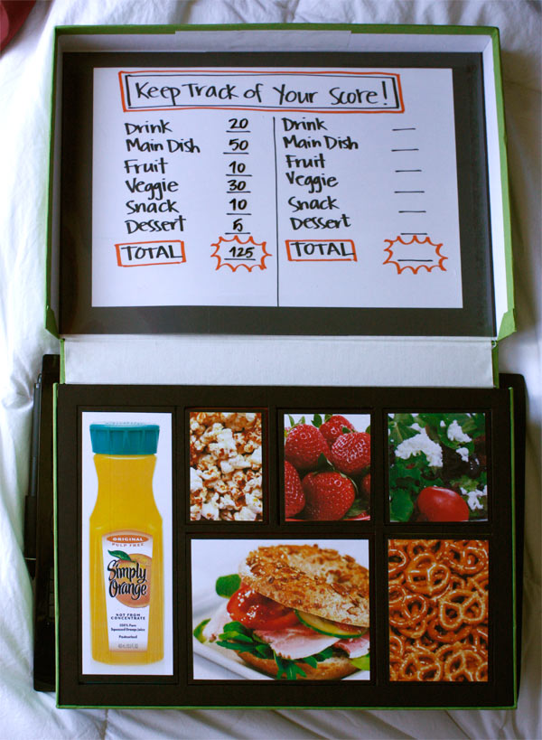
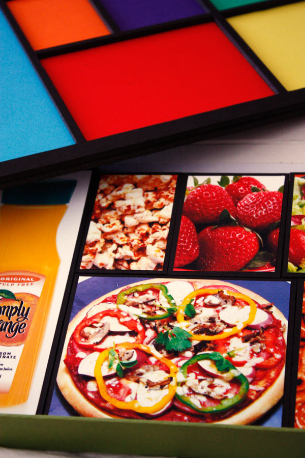
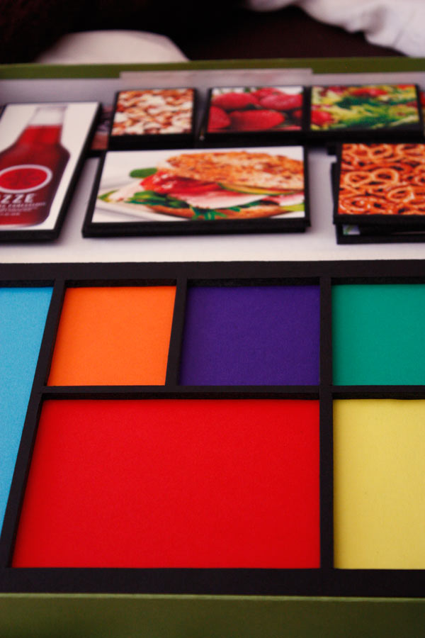
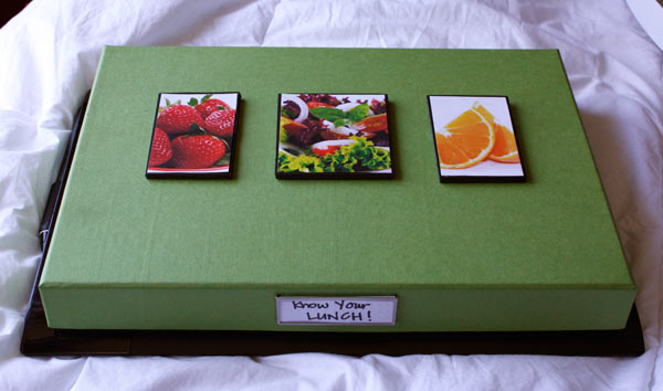
My final project used enticing and vibrant color as a means to start chipping away at our country's childhood obesity epidemic. My goal was to create a visually stimulating toy/play experience that would allow children to "accidentally" learn some things about nutrition while they competed agains their own past scores or their friends.


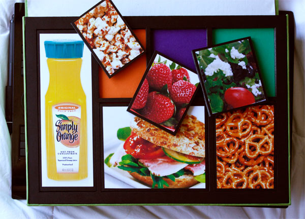
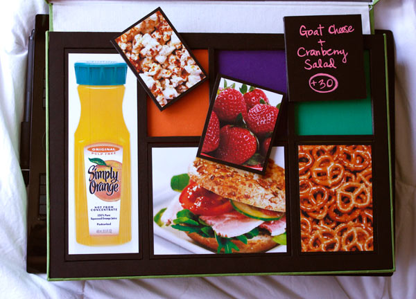
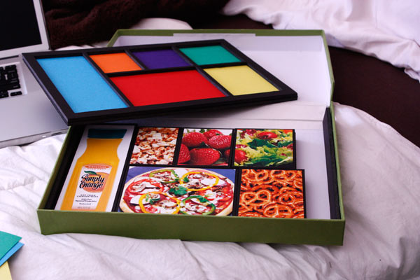
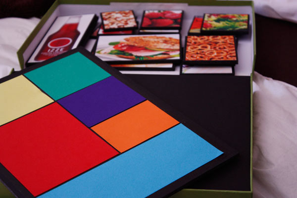
The toy/game consists of a shallow box that contains a number of game pieces, each of which has a vibrant photo of a healthy food on it, and a point value on the back that would ultimately be derived from a thorough analysis of their nutritional value. (In later iterations I would also introduce a small number of unhealthy foods with negative point values.) The objective is to assemble the meal that they think will get the highest point value! (There is even a dry erase scoreboard included on the lid to keep score.) There are six different "compartments" or "slots" for the pieces to go in, sized so that the child has to include on item from each food group in their final meal, and a collection of extra pieces in a hidden compartment under the main board.


My hope is that with repeated playing of this type of game, children would become familiar with healthy foods and be more likely to eat or request them in real life. When you spend so much time looking at beautiful photography of saturated vitamin-rich foods, for many people frieds foods would start to look less and less appetizing—and while I realize this is less likely to happen with kids, I believe that there is something to be said for our instinctual attraction to brightly colored (read: nutritionally valuable) fruits and vegetables that was developed over thousands of years. Marketing is certainly a tough beast to go up against, but this type of activity could only help, not hurt, the situation.


In addition, the game would work in some ways like a game of Memory, where the child would start to remember the point values associated with each type of food, which would hopefully stay with them later in life. Giving kids a sense of what food is good or bad for them at a young age in a positive way could be highly valuable by allowing them to wield some knowledge on nutrition without burdening them with worries about calories and fat—burdening children with the concept of "dieting" at a young age can be dangerous for some, potentially leading to the beginnings of bad lifelong relationships with food.


Images of the final/current prototype can be viewed below:


Know Your Lunch!Know Your Lunch!Know Your Lunch!Know Your Lunch!Know Your Lunch!Know Your Lunch!Know Your Lunch!Know Your Lunch!Know Your Lunch!

Monday, April 4, 2011

Tuesday, March 8, 2011

Zine Update | Color and Pattern

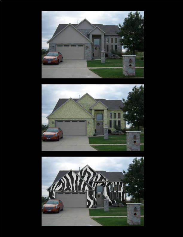
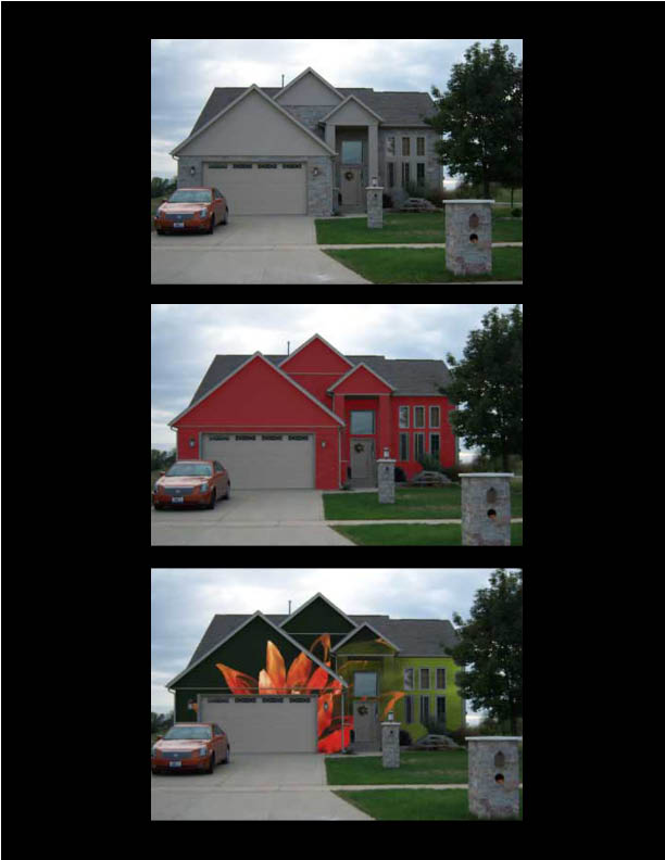
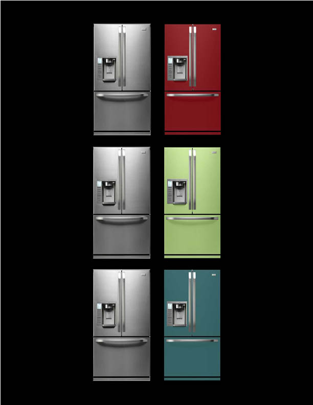
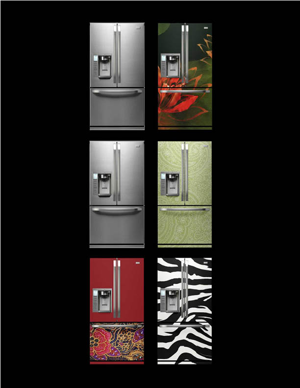
After a very helpful in-class critique, I decided to go in the direction of investigating the impact of color and pattern on the objects around us. Specifically, I want to examine the role of ubiquitous and plain artifacts (appliances, homes, vehicles, and other utility artifacts) in our lives, and how that role might change if we were to give it a new personality through the layering of color and pattern.


For imagery, I started playing around with some images of everyday artifacts and what they might look like if they were to be painted with either bold color or patterns. I love how the mood of both objects (I chose a home and a refrigerator for this round) changes completely with each color/pattern change, and am excited to look more into this area of exploration.


The House.

Color and Pattern

Color and Pattern

The Refrigerator.

Color and Pattern

Color and Pattern


The Zine Itself.

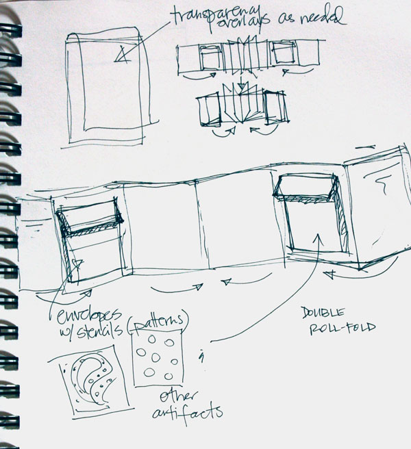
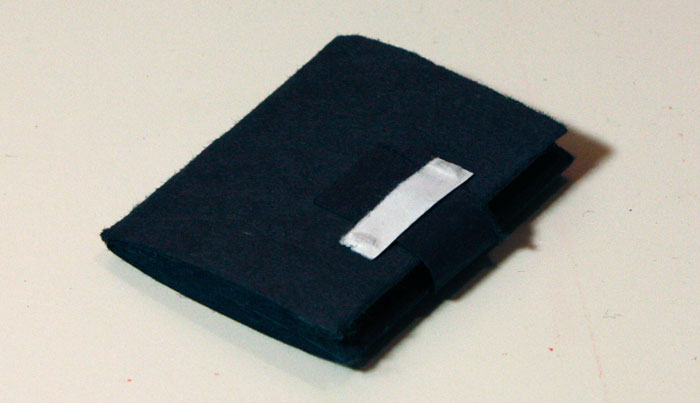
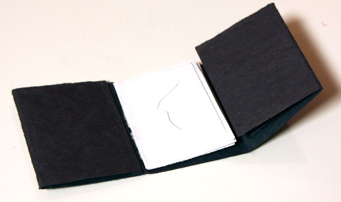
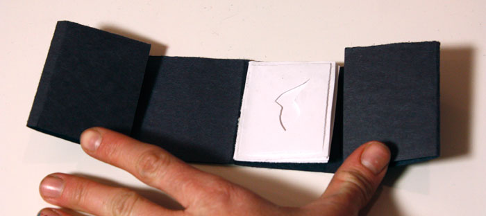
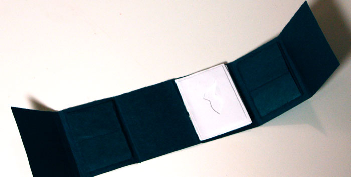
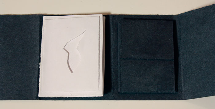
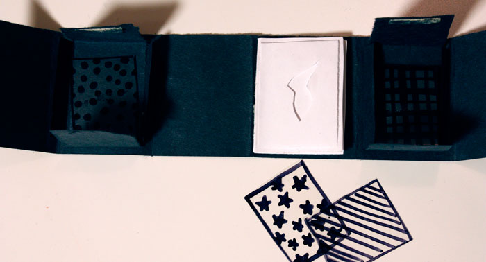
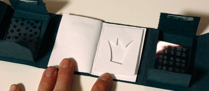
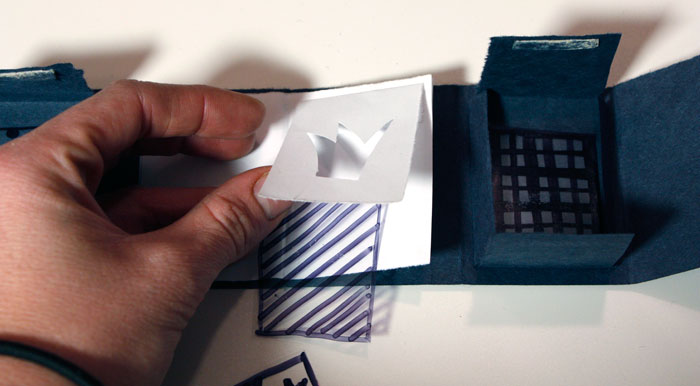
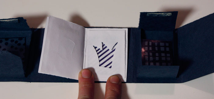
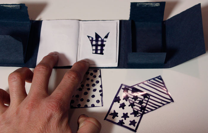
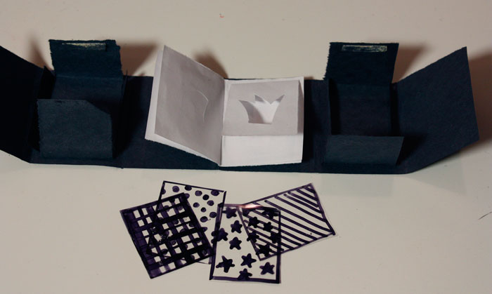
For the zine, I want to play with the idea of giving the user a sort of simplified tangible mini-Photoshop where they can experiment with pattern and objects on their own (in addition to some imagery like the pictures above that I would execute). The form I'm currently playing with is a double roll fold with interior pockets to hold patterned transparencies for the user to place over various images—each image would have a separate mask layer that would allow the user to insert the transparency in between the two layers in order to "apply" the pattern to the object and not the entire photo.


Photos of the current mini-prototype are below.


Color and Pattern | Zine

Color and Pattern | Zine


Color and Pattern | Zine

Color and Pattern | Zine

Color and Pattern | Zine

Color and Pattern | Zine

Color and Pattern | Zine

Color and Pattern | Zine

Color and Pattern | Zine

Color and Pattern | Zine

Color and Pattern | Zine

Color and Pattern | Zine

Tuesday, March 1, 2011

Zine Directions

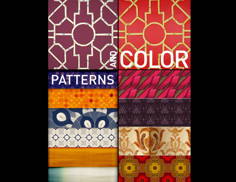
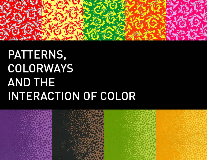
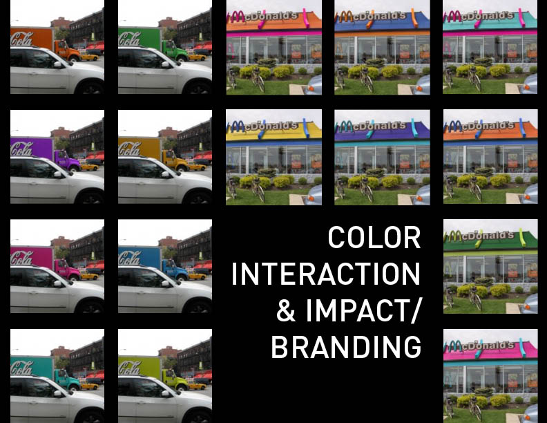
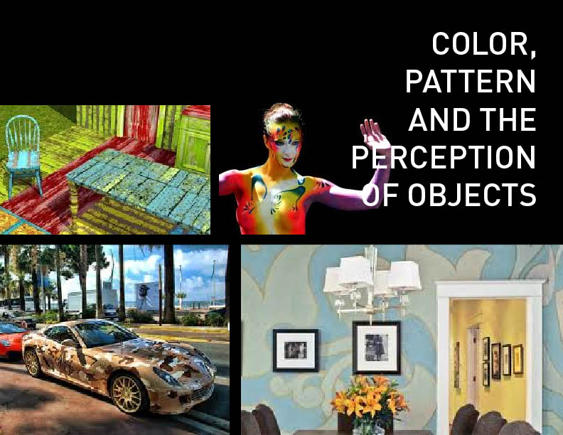
I'm still a bit all over the place as far as concepting for the upcoming zine project, but I suspect that I'll want to dig into the interactions of colors in pattern, as well as the use and interpretation of both patterns and the color interactions within them. I'm not sure if it will mean focusing on something pragmatic like branding/personality (shown in a slide below) or more on the day-to-day perception of objects and what might happen if objects normally lacking pattern were suddently inundated (see last slide) but I would love to explore this realm for the project.


Color Zine Concepts


Color Zine Concepts

Color Zine Concepts

Color Zine Concepts

Tuesday, February 22, 2011

Color Analysis

Color Analysis


My favorite part of this exercise was seeing how close some of the colors turned out to be despite the vast differences in some of the other swatches.

Master Image | Liz Rutledge


The painting: Gaugin's Femme portant un fruit, 1892 (Woman carrying a Fruit)


The colors that make this image for me: deep reds, bright lime greens and yellows, bright and toned down oranges and yellow-oranges, deep greens, cornflower blues, deep purples, tans and browns.

Weekly Photo (2/22) | Liz Rutledge

Tuesday, February 15, 2011

Color as Culture | Liz Rutledge

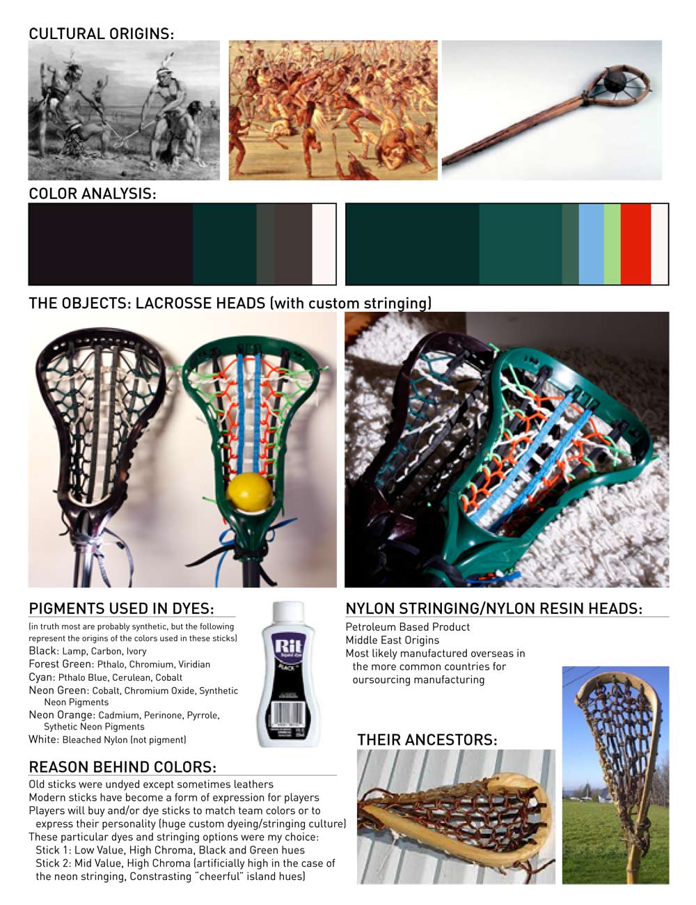
For this color as culture assignment, we were asked to pick an item with cultural significance and look at how the colors (and the pigments that may have created them) interact with the object and the culture they're representing. As I don't really identify strongly with any culture, I chose to look at two of my lacrosse sticks, due to their rich history in Native American culture and in my life as well.


Lacrosse Stick Analysis

While the two that I chose to picture are made of plastic (nylon resin) and strung with nylon stringing and leather, they originate from a culture of handmade sticks made from natural materials (pictured top and bottom right). The game of lacrosse (baggataway as it was called in certain Northeastern tribes) was an integral part of Native American life, used both for enjoyment and as a method of determining the winner of land disputes. (Way better than atomic bombs, huh?) This richly ingrained history is connected to these plastic sticks still, despite how far they've come in technology, materials and appearance.


The modern game of lacrosse, and the plastic sticks that have taken over the scene in the last 10-15 years, has a very different aesthetic than the original handmade sticks, and afford players an opportunity to express themselves or represent their team colors with their dyeing and stringing choices. (I custom strung both of these sticks, and custom dyed the black head, so was responsible for these particular color choices.) The new colors present in modern sticks may take them far away from the originals, but in a way reflects the spirit that was present in the first sticks—the Native Americans believed (and I'm sure many still do) that a warrior's stick was linked to his soul, almost as an extension of his person. By being able to customize the colors of plastic sticks, we have taken back some level of control over the otherwise mass-produced items, injecting our spirit back into those nylon resin molds.

Skin Tone Self-Reflection | Liz Rutledge

My perception of my own skin tone changes with the season (my coloring when "tan" and "pale" can totally change my overall appearance through the way my skin tone relates to my hair, eyes, etc) but at this particularly wintery moment, I'd say that my skin is on the light side of the worldwide spectrum. It's definitely not in the palest grouping, and has a little bit of an olive undertone (further evidenced by how much better I look in reds and oranges than a wide variety of the cooler blues) but is lighter than what I would imagine to be average worldwide.


Depending on what part of my skin you were trying to match (whether you were aiming for my hand, the inside of my forearm, my face, my collarbone, etc) I would expect it to include some warmer reds and greens with some white to lighten it up, and I'm sure some nuances of other colors as well. (Maybe some yellow? I'll have to tinker.) It'll be interesting to see what really does go into mixing my own skin color with paints, it would definitely help me in my painting to be able to mix convincing skin tones in order to breathe some life into human subjects.