Nick told me about a book store he discovered in the West Village called OHWOW Book Club
It looks like a great place visit if you have some time. THANKS NICK!
Visit Printed Matter as well. It carries loads of handmade books and zines. Some of you may be interested in selling your work there!
Showing posts with label Zine. Show all posts
Showing posts with label Zine. Show all posts
Tuesday, April 5, 2011

Saturday, March 26, 2011
Shaun - Homework - Week08 - Zine


Inspired by the eastern view on “white,” my zine uses the haiku of the famous Japanese poet Kobayashi Isaa and the photos I took to represent my idea of “white.” Born in 1763, Kobayashi is regarded as one of the four haiku masters in Japan. His haiku are often about everyday life. I use the most basic need for human—food (rice and noodle) and the basic eastern tableware (cup, bowl, chopsticks, & spoon) as the theme. By combing the images and the selected haiku, I tell the story of “white.” The title of this zine is called “A Cup of White Tea” because Kobayashi’s name Issa means “a cup of tea.” “White” represents empty and void, but that doesn’t mean lifeless. It means full of energy and imagination. An empty bowl is full of life because it could be filled with anything. The possibility of “white” is endless.
P.S: It is hard to tell in the photos, but the background colors of the haiku parts are in different "white" and the English translation of the haiku are also in different "grey."
Wednesday, March 23, 2011
Suzanne's Zine Prototype
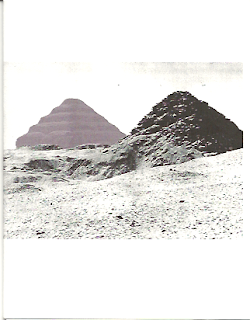
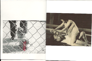


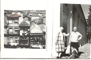

(Untitled)
My zine is in the traditional zine format of loosely bound pages. I apologize for the scanning, some images are crooked. Also, the transparent layers are basically invisible. Several members of the class have seen them so they do exist!

Concept:
memories are selective and the color of those selections becomes achromatic over time. memories from a past, maybe mine, maybe someone else's...It's a personal yet impersonal selection.
Why?:
2 years ago a large box containing all my saved mementos, photographs prior to digital, letters, collections, etc. was stolen out of a locked car while my bf was moving. I'm now obsessed with retaining memories of my past. The artifacts of my life were gone in an instant and the memories of those moments are fading with time. Luckily some photos I had scanned.
Materials:
scanned film and digital photographs
transparencies
inkjet printer
Process
I assembled photos into a little booklet. Over most pages I selected parts of the memory that were remembered and added color to them. This I printed onto transparent layers.
When you page through the zine, a different memory's achromatic color can be viewed on the adjacent page creating a subtle change in composition. I though this was interesting.
For instance page 1 has a little dog behind a fence with a red cast that is initially viewed as a red object over two women struggling.
I think these new compositions and elements are interesting to discover, they help you remember the moment, and I chose them as selections of that memory that were remembered.
With the dog example, I never remembered the actual type of dog or that it was even behind a fence when I took the photo years ago. I only remembered that it had a red cast. The two women struggling is timeless yet it's faded color places it in the past. (from a movie poster my aunt was in in the 60s Philippines).
On page 10 is a family moment. It feels both happy and melancholoy. Its adjacent transparency has an achromatizing color bridge of pink. To let your eyes settle is to notice the towers behind the thick fog. Was it a happy day? was it melancholy? I don't remember but I've always remembered the thick smog that came out greys and pinks from the disposable camera that I finally developed 7 years since the photo was taken.
Next prototypes...I'd like to add more elements to the transparencies between spreads that are more hints of color.
I also am interested in adding dimension to the zine by printing the zine onto all transparencies and binding it in such a way that i can fan it 360 degrees out as in this image below. I'd like to evenly space each transparent page so that the are a even distance from each other. This would be held up by string as it spins around and colors blend furthur blurring and abstracting these memories.

Do you have any suggestions for me? Feel free below....
Tuesday, March 22, 2011

Monday, March 21, 2011
Weekly Photo
 Paint Experiment for my project!
I used coloring with oil and used a hair drier for movement.
Tuesday, March 8, 2011


Zine Update | Color and Pattern
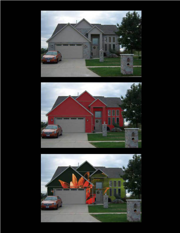
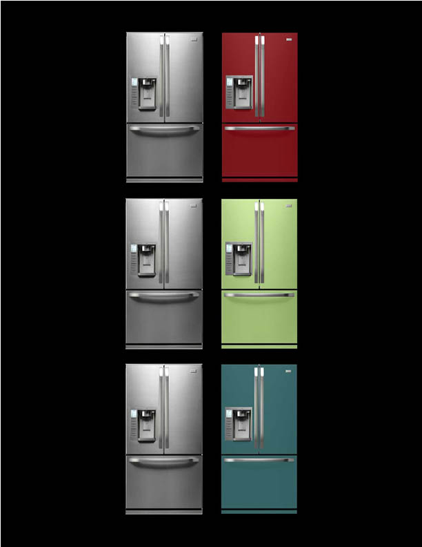
After a very helpful in-class critique, I decided to go in the direction of investigating the impact of color and pattern on the objects around us. Specifically, I want to examine the role of ubiquitous and plain artifacts (appliances, homes, vehicles, and other utility artifacts) in our lives, and how that role might change if we were to give it a new personality through the layering of color and pattern.
For imagery, I started playing around with some images of everyday artifacts and what they might look like if they were to be painted with either bold color or patterns. I love how the mood of both objects (I chose a home and a refrigerator for this round) changes completely with each color/pattern change, and am excited to look more into this area of exploration.
The House.
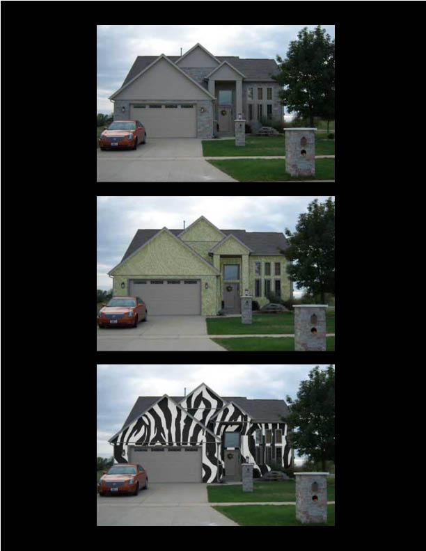
The Refrigerator.
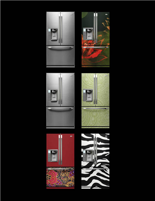
The Zine Itself.
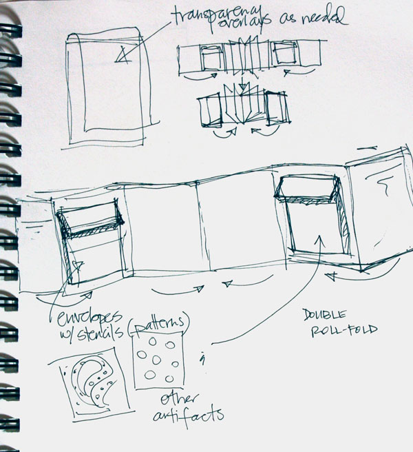
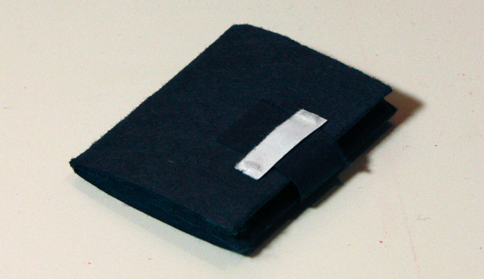
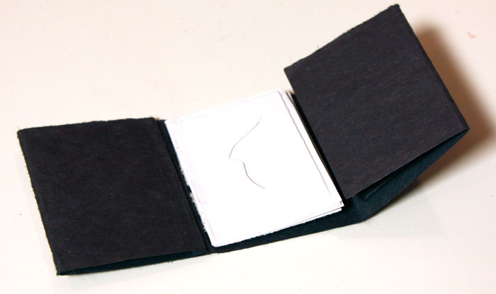
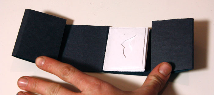
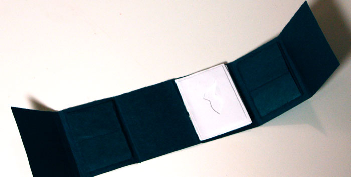
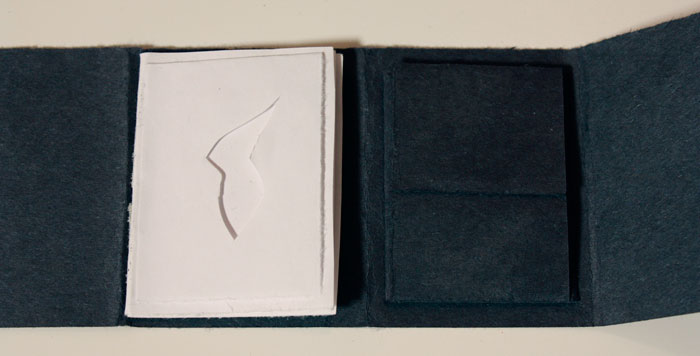
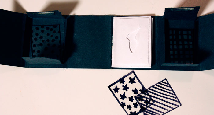
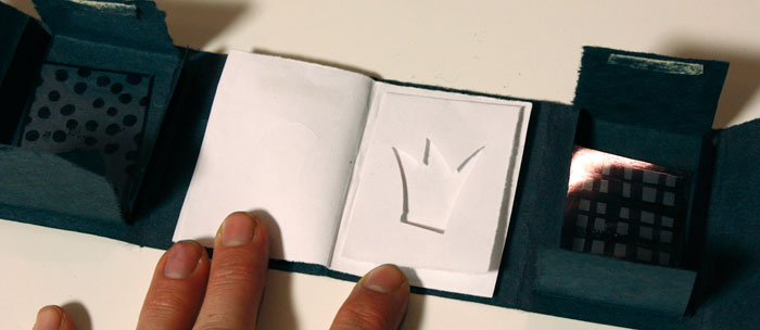
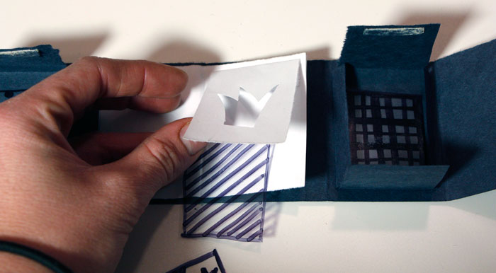
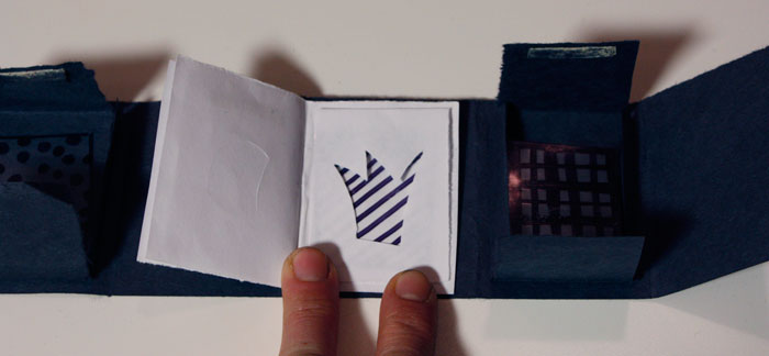
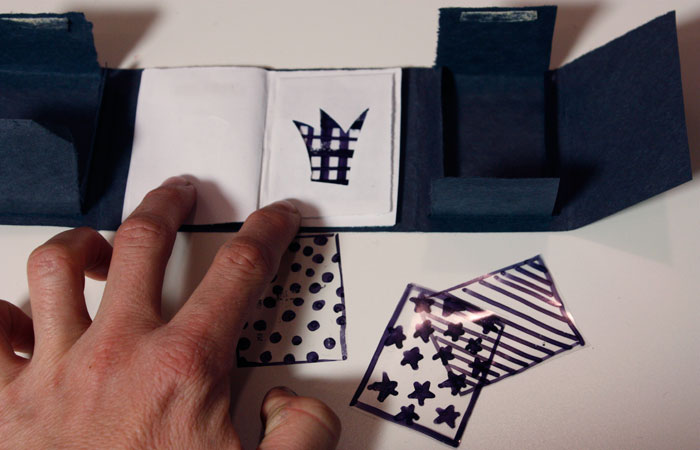
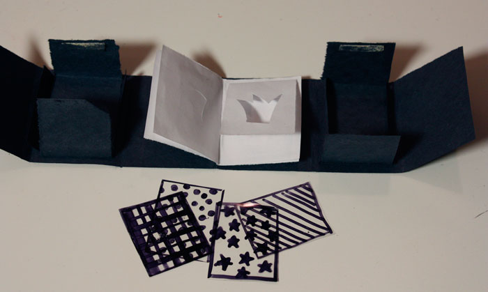
For the zine, I want to play with the idea of giving the user a sort of simplified tangible mini-Photoshop where they can experiment with pattern and objects on their own (in addition to some imagery like the pictures above that I would execute). The form I'm currently playing with is a double roll fold with interior pockets to hold patterned transparencies for the user to place over various images—each image would have a separate mask layer that would allow the user to insert the transparency in between the two layers in order to "apply" the pattern to the object and not the entire photo.
Photos of the current mini-prototype are below.
Sunday, March 6, 2011
Zine Proposal

Post card series:
Culture+Paint+experiment+photography = Communicating new ideas
This weekend I spent doing some photography, messing with paint and basically wanted to get an idea of how light and photography affect the movement in paint.
Although my experiment did not give me exact results that I was looking for, I learnt a lot about what it means to use quality paint, consistency of the paint itself, paint texture, etc. It was a lot of fun as I love photography and paint. For my first experiment the results were pretty good. Certain shots spoke a lot to me and they tapped a certain emotion. From this experiment I figured if I dug deeper I would come up with really cool results.
For my project I would like to experiment more with other materials along with paints to create a postcard series depicting culture and color. Sorry about not being able to post the pictures separately and thus making the post long.
Subscribe to:
Posts (Atom)

 Posts
Posts


