Showing posts with label Suzanne. Show all posts

Tuesday, May 10, 2011

Suzanne Final Project

Color As Language Final Project
Title: Hidden Color
Description: scaled-down installation model. This installation would be in the form of a black suspended cube composed of many square panels strung on cables to appear as if there is a black floating cube. Upon closer inspection, the visitor would notice bits of colored light escaping through the spaces between panels as they are not perfectly flush against one another to allow light to enter and escape. The visitor would enter the cube by ducking under the cube between the cables. The visitor may also just peek through from the outside. On the inside is an experience of infinite reflection and brilliant color. The visitor is invited to experience this color as a way to bring color into our often monotonous and routinized lives. I'm also interested in the juxtaposition of industrial and man-made forms vs an organic and uncontrolled environment where the installation is placed and how the two contrast and create new experiences. I see this piece installed in several contrasting locals...the urban space, a space of industrial decay, a large body of water, in a forest and finally in a snowy mountainous area.


Early rendering of installation


This model is scaled down 80%...I think : )

Monday, May 9, 2011

Suzanne Weekly Photo 11


Illustration from vintage Persian/Iranian children's book.

Suzanne Weekly Photo 12


I love how this image almost appears to be achromatic but if you look closer there is a little color on the chickens. You can feel how cold this day must be.

Tuesday, April 19, 2011

Weekly Photo 10


These are an art installation made by an modern African artist (forgot name) who took traditional pottery and covered them with industrial pigments.

Tuesday, April 12, 2011

Solving Nutritional Deficiency

I think that most North Americans eat foods that are either void of nutrients or not meeting even minimum standards of nutrition. This has to do with many factors including the industrialization of food production, post-war generations raised on processed and convenience foods, lack of availability, urbanization, economic factors or even social stigma. This nutrition deficiency leads to lack of energy and well being and as we age, can progress towards illness and preventable diseases such as diabetes or heart disease.
Today there is a food revolution happening and mainstream media is finally taking note. Governmental guidelines are changing for the better year after year even due to the corporate food lobby.
With information at our fingertips via the internet and social networking, anyone can easily access information about eating healthy today if they want to.
I'm not interested in creating more information but to create a way to use color to serve as a reminder.
My audience is teen through adult who are getting the information in bits and pieces and now that information has become repetitive ambient noise (or nagging).
My visual sculptures will hope to inspire people to remember to eat and buy foods that contain the colors of the color wheel. The foods highest in pigment contain the highest phytonutrients or nutrition.
1)My first solution is to create a mobile of abstract color forms that suggest fruits and vegetables.
2) My second idea is to create a cube made of black wire so you just see the frame. there will be a curtain of black "beaded" wire surrounding the box. but if you move aside the black curtain, the brilliant hues of nature's nutritious foods will be hidden inside.
3) The third idea can be in information wheel. I could have a color wheel on the top layer with a cut out window. the bottom layer will have a color wheel of fruits and vegetables corresponding to that color.


weekly Photo 9

Tuesday, April 5, 2011

Wednesday, March 23, 2011

Weekly Photo 7

One of the paint blot paintings I made recently. I look at this painting almost everyday and see different things, mostly I see two heavenly bodies that are pulled towards each other but also upwards towards the distant unknown.

Suzanne's Zine Prototype


(Untitled)
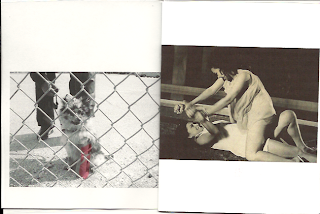
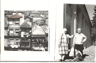
My zine is in the traditional zine format of loosely bound pages. I apologize for the scanning, some images are crooked. Also, the transparent layers are basically invisible. Several members of the class have seen them so they do exist!
Concept:
memories are selective and the color of those selections becomes achromatic over time. memories from a past, maybe mine, maybe someone else's...It's a personal yet impersonal selection.
Why?:
2 years ago a large box containing all my saved mementos, photographs prior to digital, letters, collections, etc. was stolen out of a locked car while my bf was moving. I'm now obsessed with retaining memories of my past. The artifacts of my life were gone in an instant and the memories of those moments are fading with time. Luckily some photos I had scanned.
Materials:
scanned film and digital photographs
transparencies
inkjet printer
Process
I assembled photos into a little booklet. Over most pages I selected parts of the memory that were remembered and added color to them. This I printed onto transparent layers.
When you page through the zine, a different memory's achromatic color can be viewed on the adjacent page creating a subtle change in composition. I though this was interesting.
For instance page 1 has a little dog behind a fence with a red cast that is initially viewed as a red object over two women struggling.
I think these new compositions and elements are interesting to discover, they help you remember the moment, and I chose them as selections of that memory that were remembered.
With the dog example, I never remembered the actual type of dog or that it was even behind a fence when I took the photo years ago. I only remembered that it had a red cast. The two women struggling is timeless yet it's faded color places it in the past. (from a movie poster my aunt was in in the 60s Philippines).
On page 10 is a family moment. It feels both happy and melancholoy. Its adjacent transparency has an achromatizing color bridge of pink. To let your eyes settle is to notice the towers behind the thick fog. Was it a happy day? was it melancholy? I don't remember but I've always remembered the thick smog that came out greys and pinks from the disposable camera that I finally developed 7 years since the photo was taken.

Next prototypes...I'd like to add more elements to the transparencies between spreads that are more hints of color.

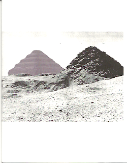
I also am interested in adding dimension to the zine by printing the zine onto all transparencies and binding it in such a way that i can fan it 360 degrees out as in this image below. I'd like to evenly space each transparent page so that the are a even distance from each other. This would be held up by string as it spins around and colors blend furthur blurring and abstracting these memories.


Do you have any suggestions for me? Feel free below....

Sunday, March 6, 2011

Weekly Photo 6


This little spider was on a white tshirt I had hung out to dry on my deck.
(Yes, I said deck, I used to have my own private deck in the trees, sigh....)

Tuesday, March 1, 2011

Pattern Color Analysis

I'm still working on the pattern template.

Francis Bacon Study of Portrait II 1956


Weekly Photo 5


Plants growing in a stream. Hyde Park Toronto

Sunday, February 20, 2011

Weekly Photo 4

Cemetery by the Santo Domingo Airport - May 2010

Saturday, February 12, 2011

Sunday, February 6, 2011

Weekly Photo 2

The back side of the house was painted orange. March 2010

Sunday, January 30, 2011

Weekly Photo 1


Yellow chair in the greenhouse upstate near Albany - March 2010